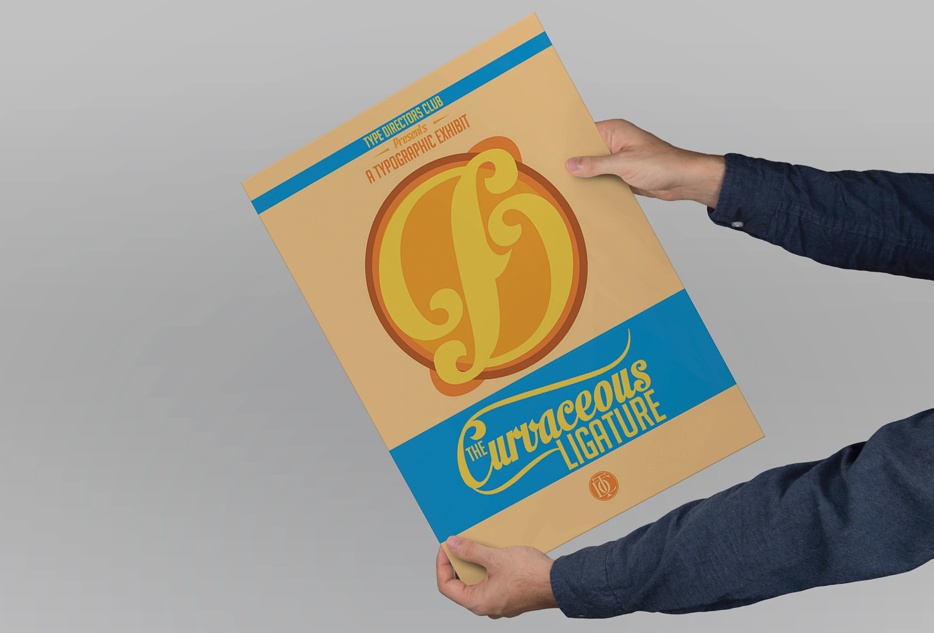
Overview
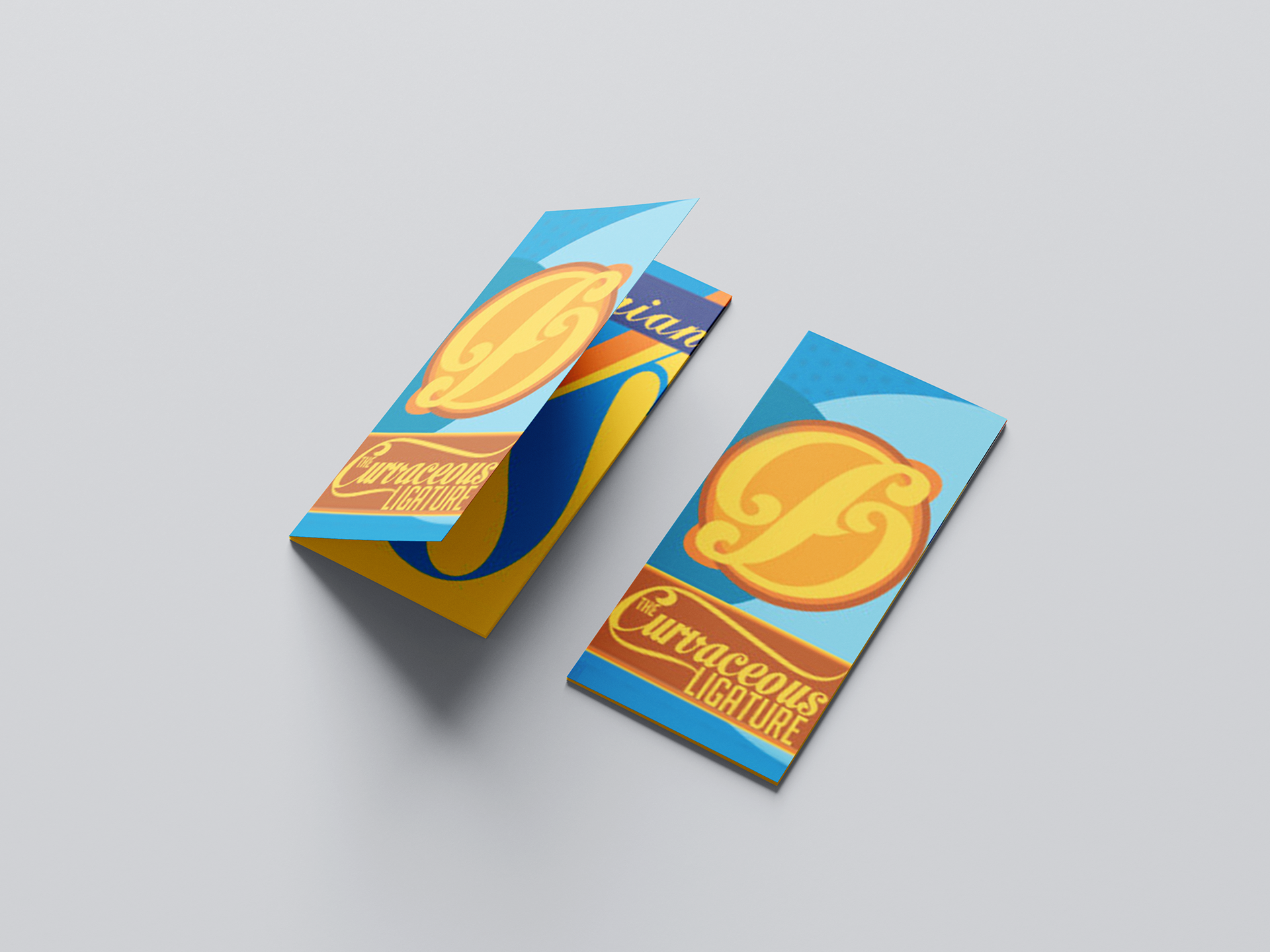
Curvaceous Ligature was an experimental typography project exploring the relationship between letterforms, visual rhythm, and editorial storytelling.
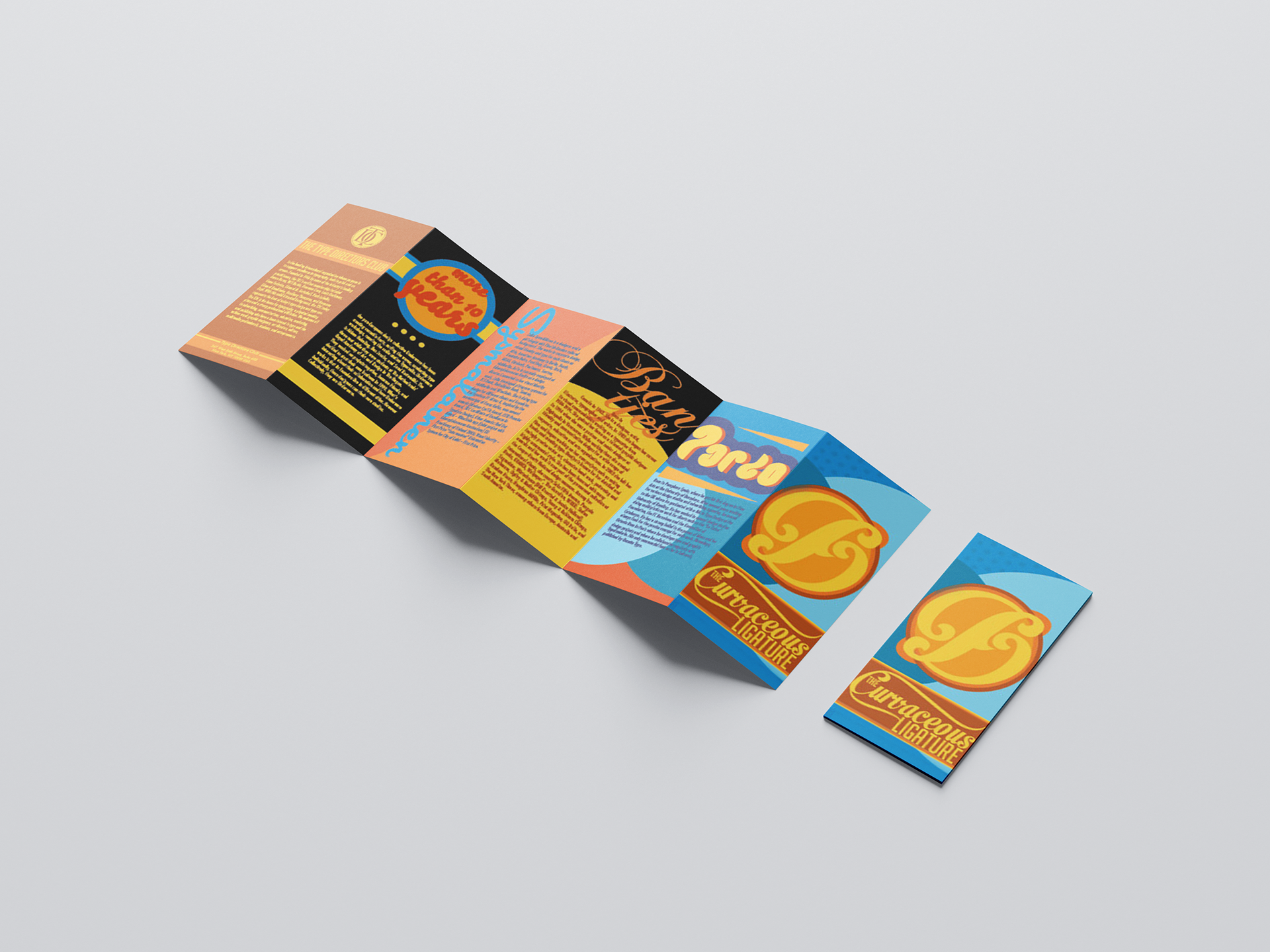
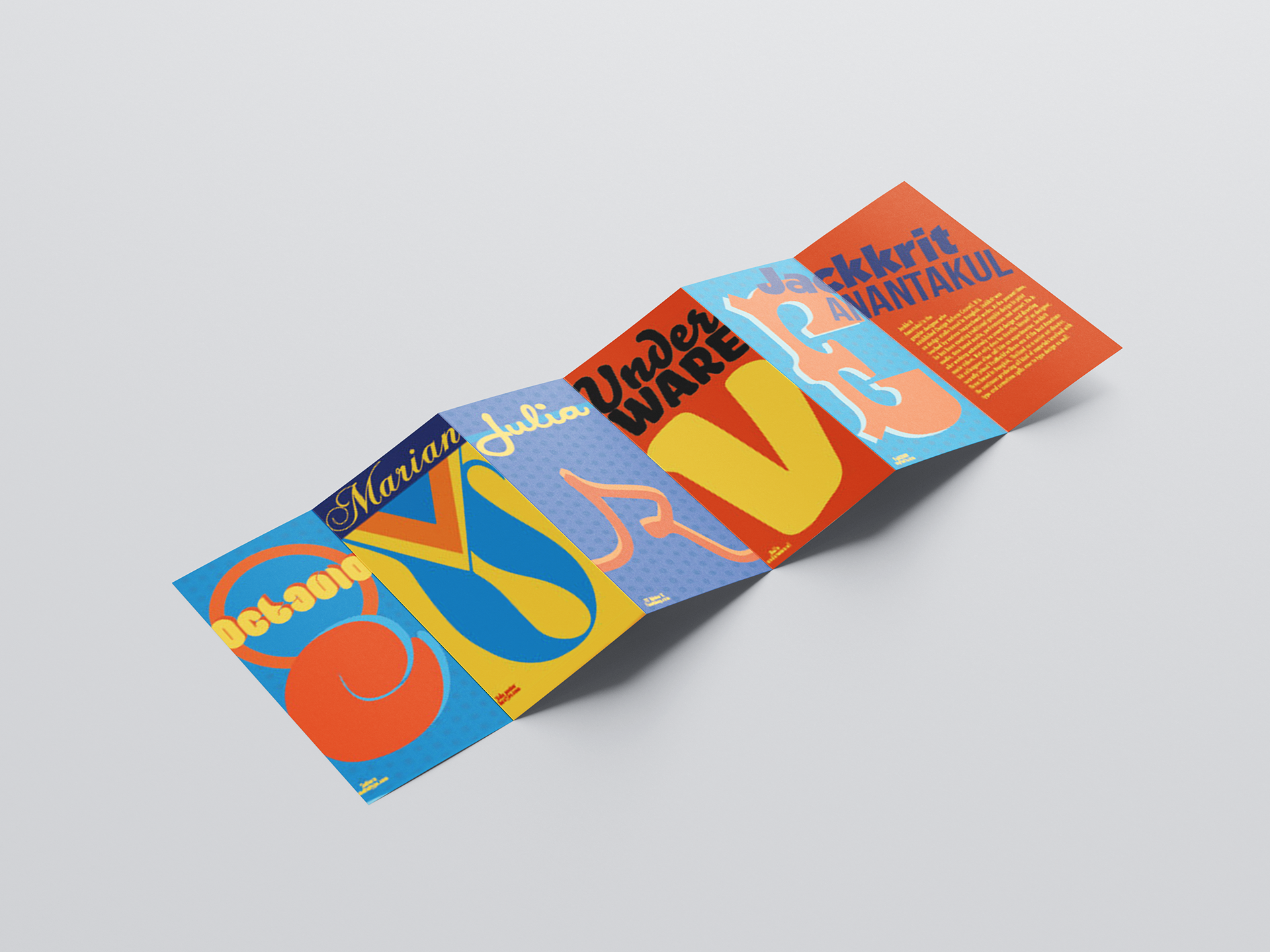
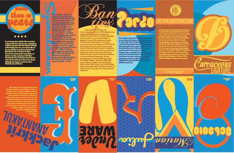
The project challenged me to design an original ligature inspired by flowing, organic curves and apply it within a custom barrel-fold brochure format. To further explore typographic expression, I researched and featured five influential type designers whose work shared similar qualities of movement, personality, and form.
Through a combination of custom lettering, publication design, and unconventional print construction, the project became an exploration of how typography can communicate emotion and identity beyond words alone.