Overview
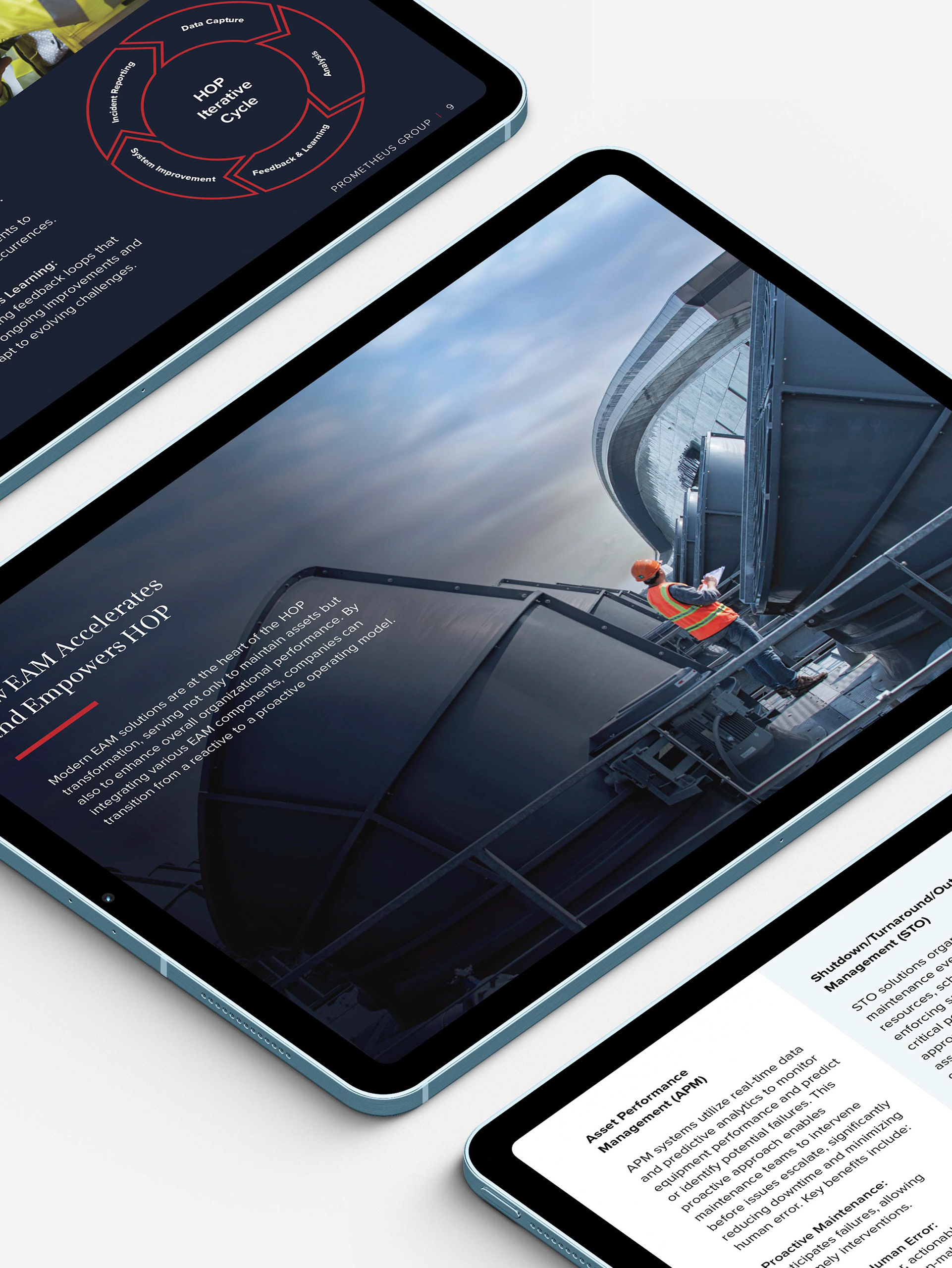
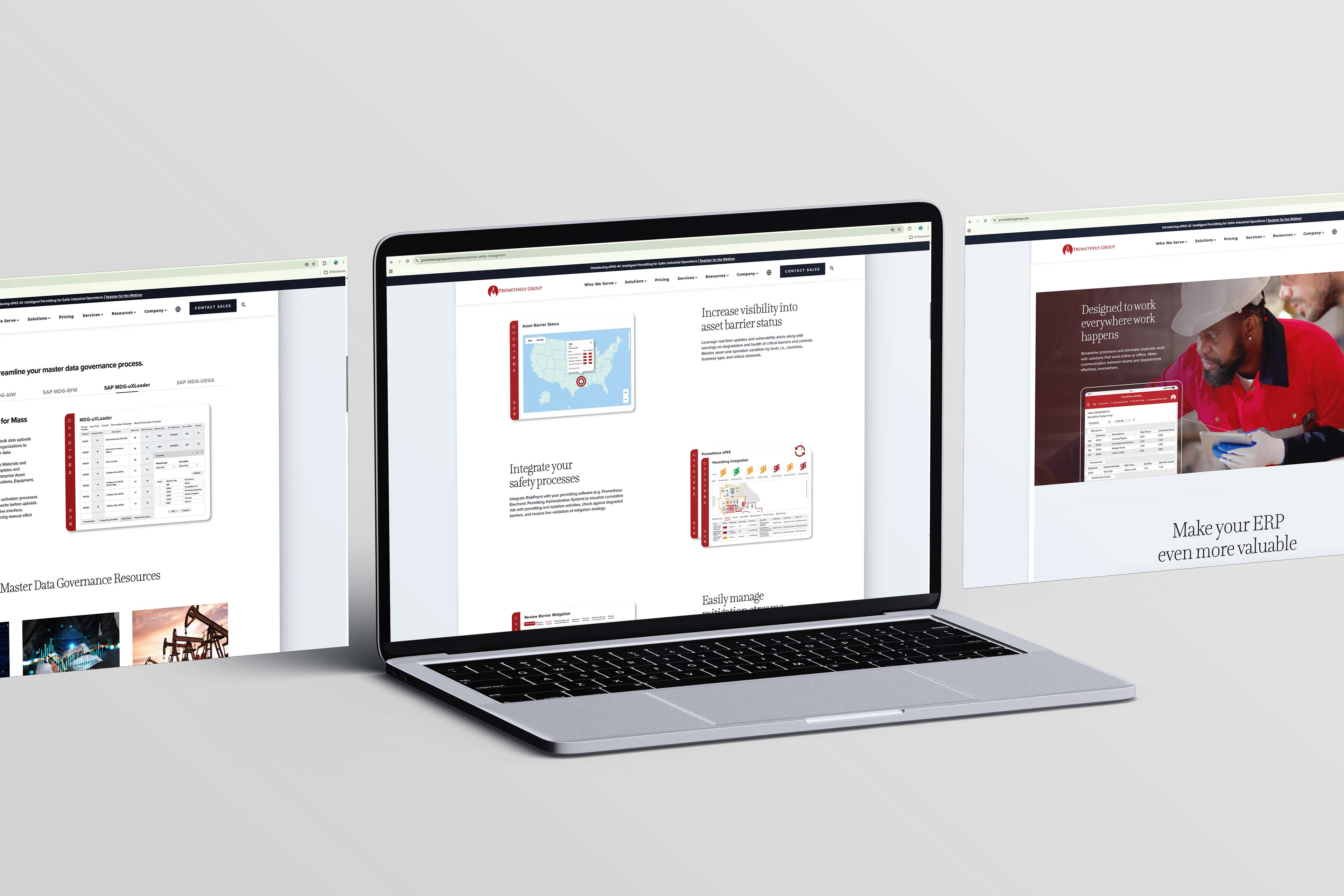
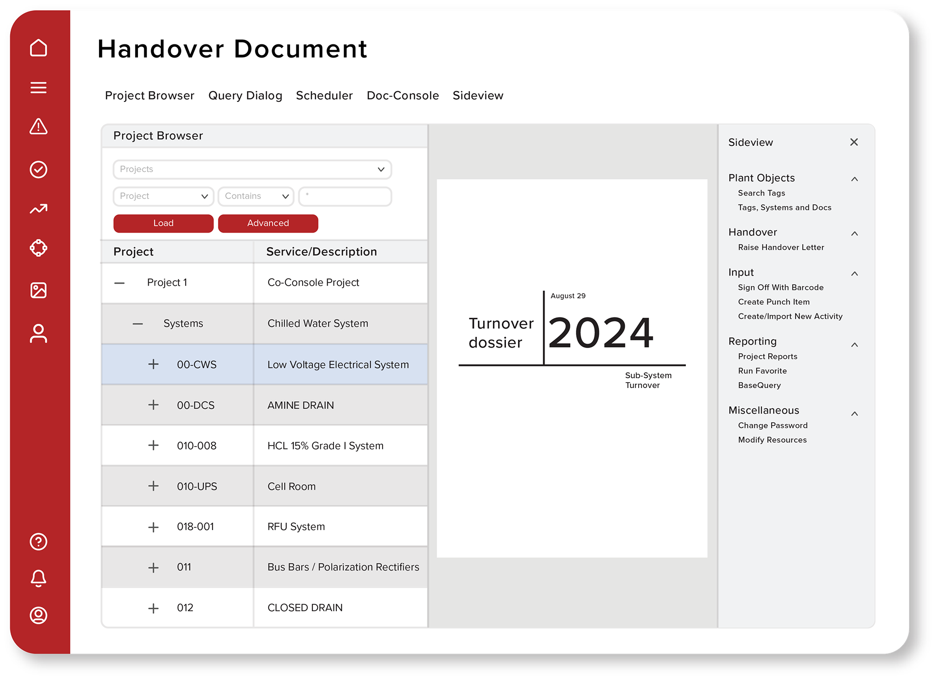
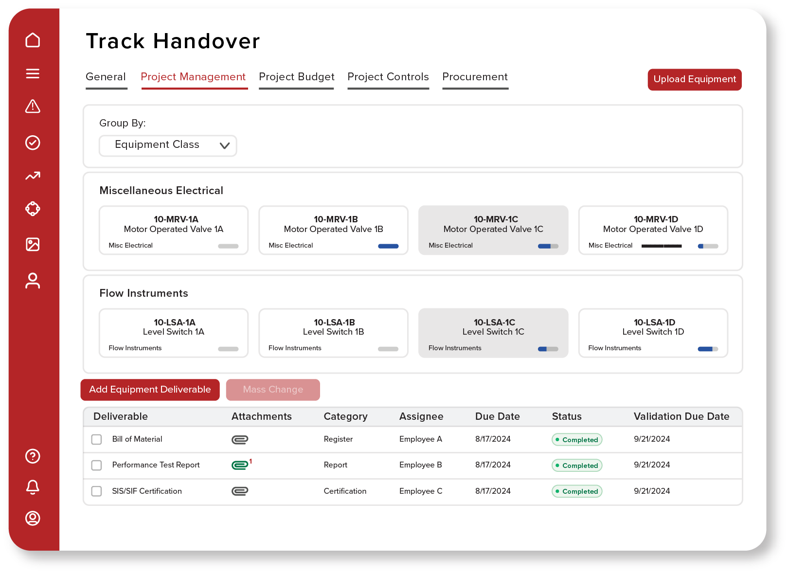
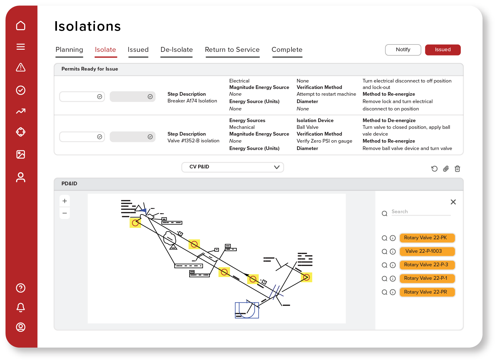
When Prometheus Group underwent a major website redesign, one challenge became immediately clear: product screenshots varied significantly in style, context, and presentation. With over 100 product features to showcase, a more cohesive visual approach was needed to create consistency across the website and marketing materials.
To solve this, I developed a scalable product illustration system that transformed complex software features into clean, engaging visual assets. By combining product screenshots with custom illustration techniques, I created a unified visual language that simplified technical concepts while improving the overall user experience.
The result was a library of 100+ product illustrations used throughout the website, helping strengthen brand consistency, improve visual storytelling, and make enterprise software more approachable for prospective customers.
Challenge
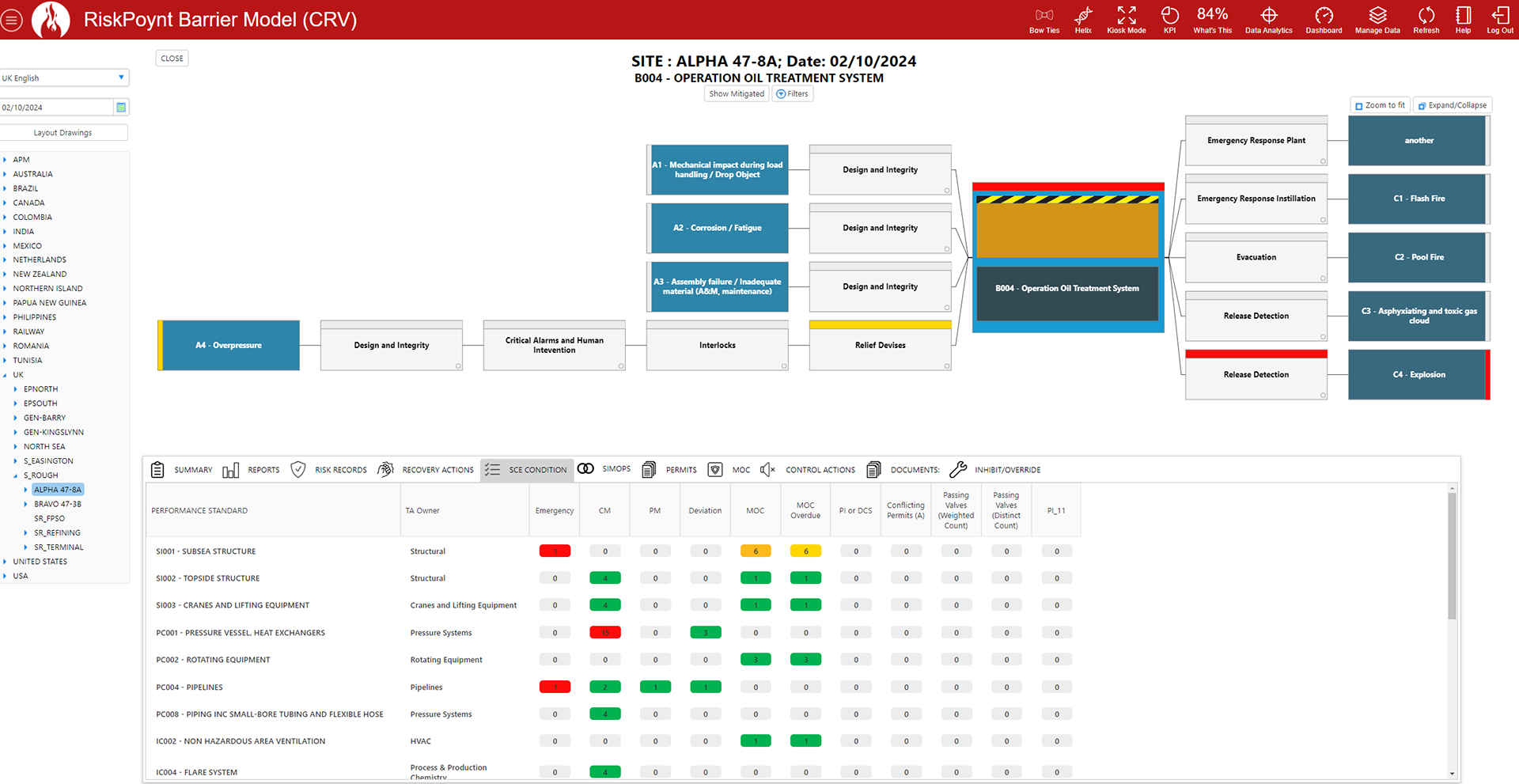
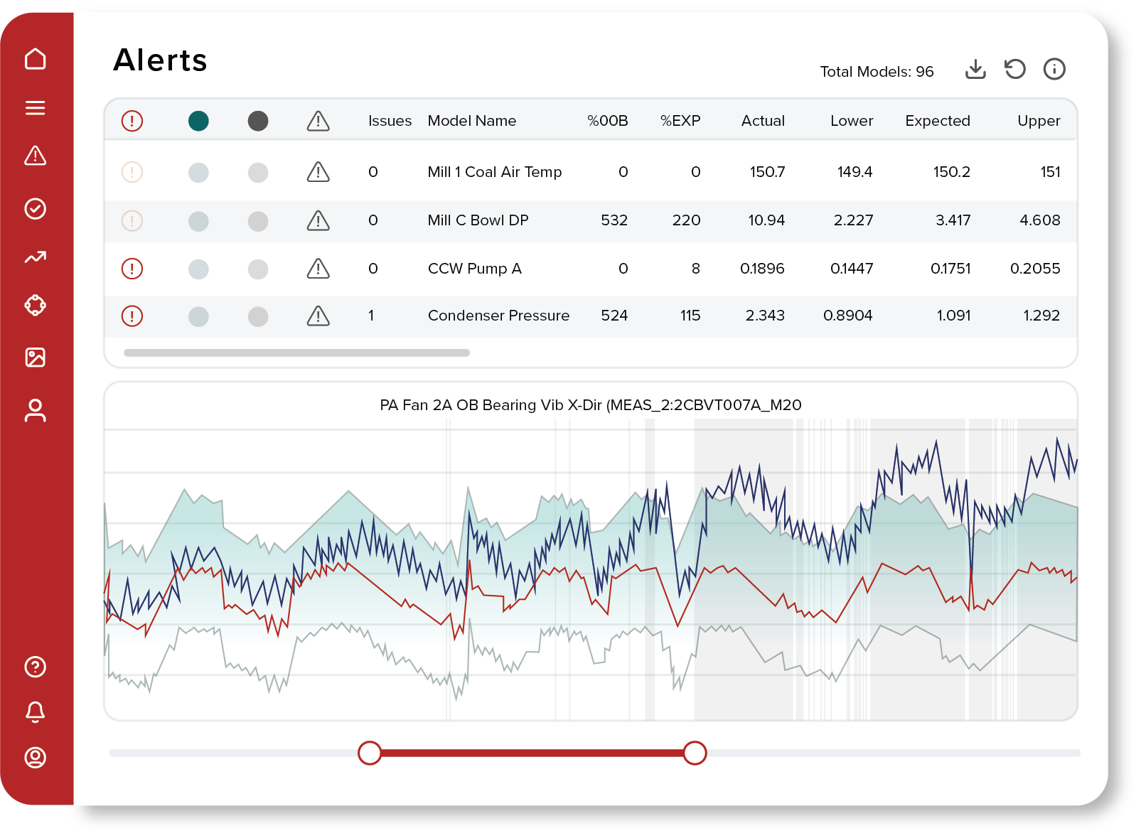
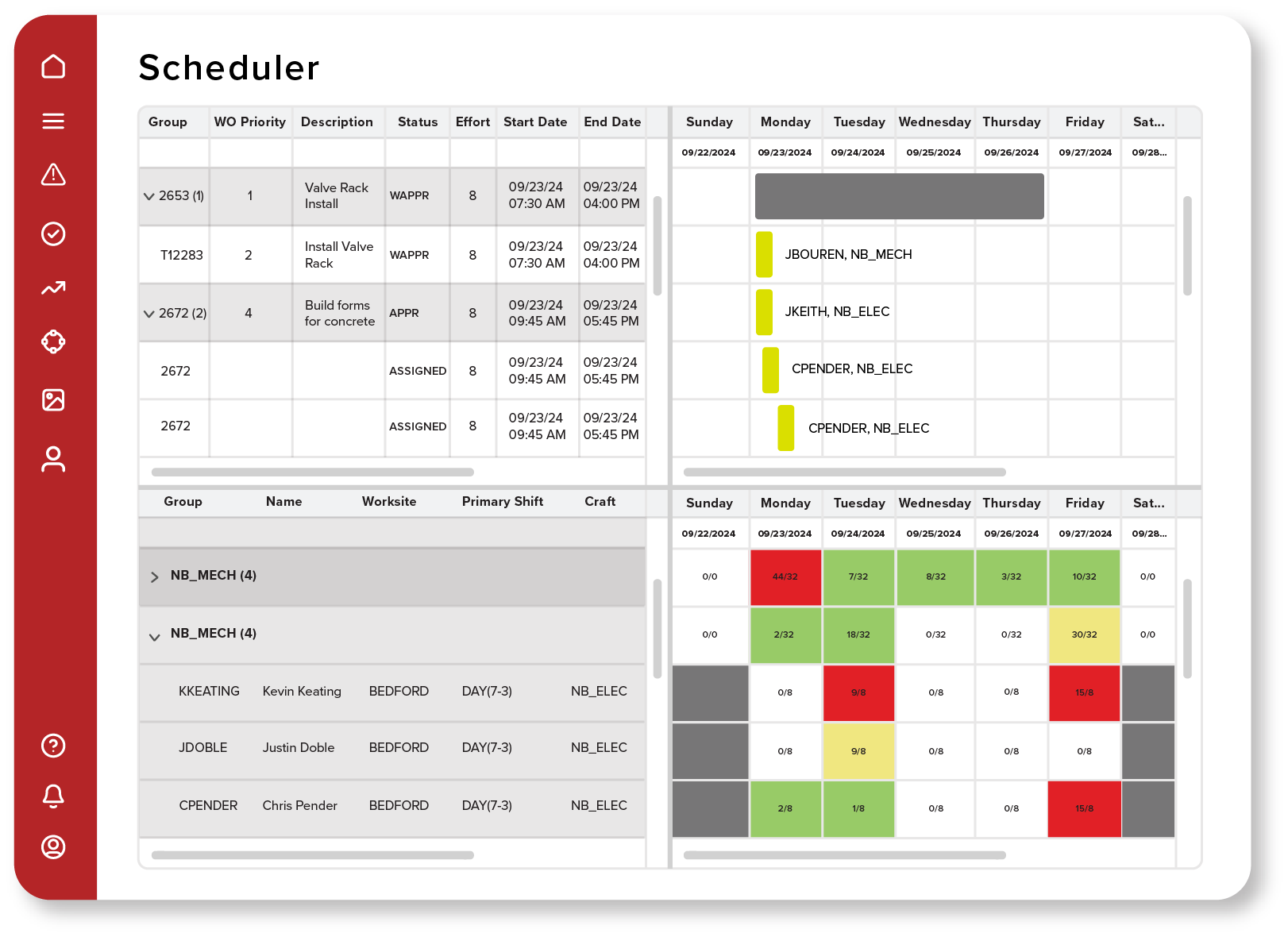
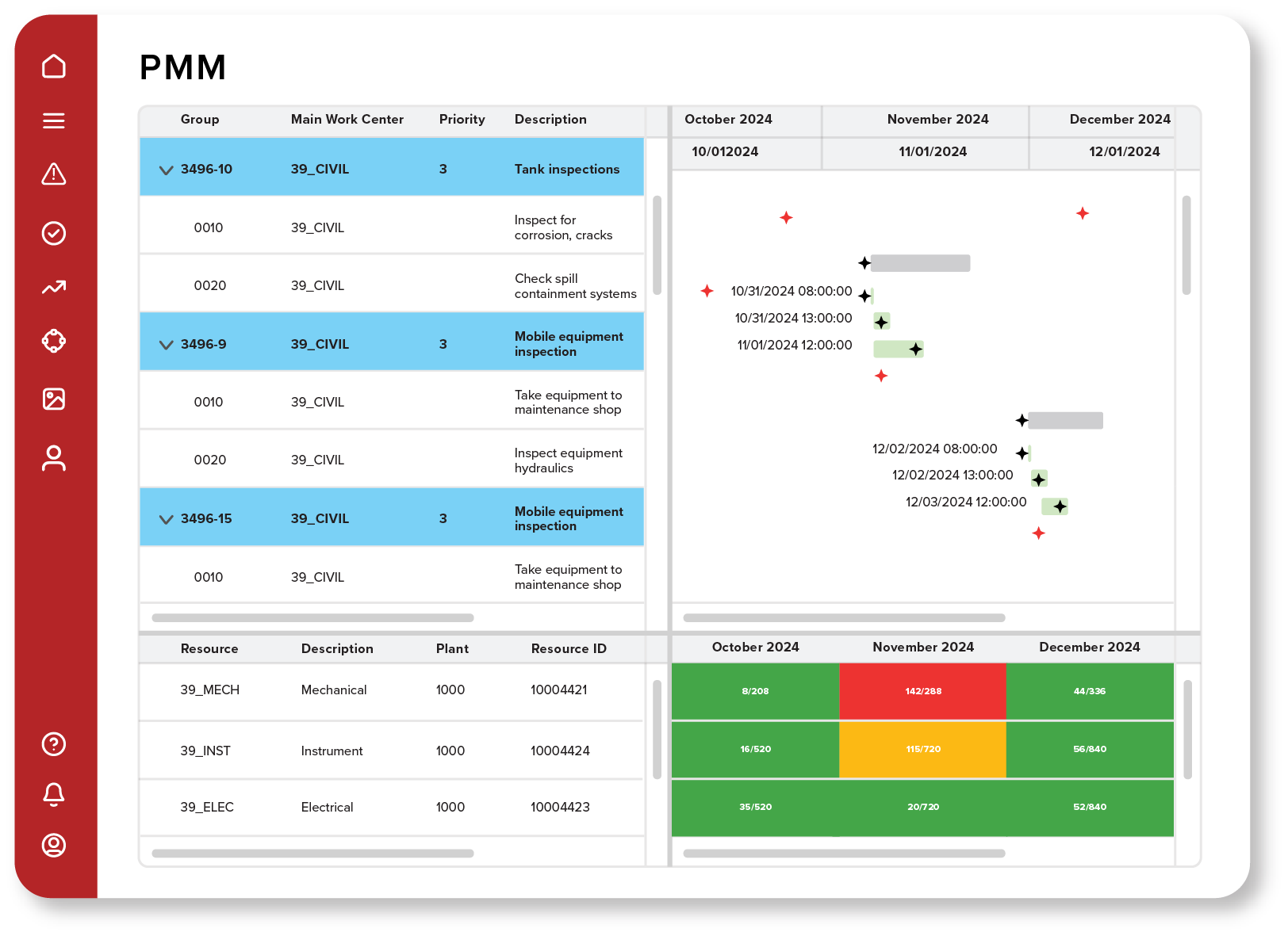
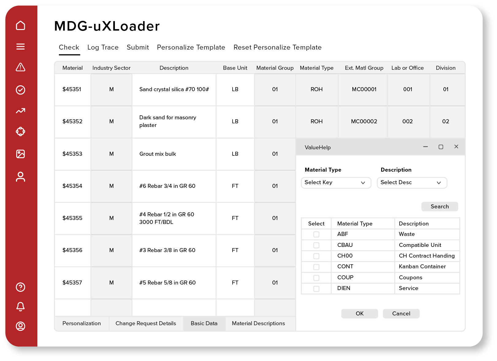
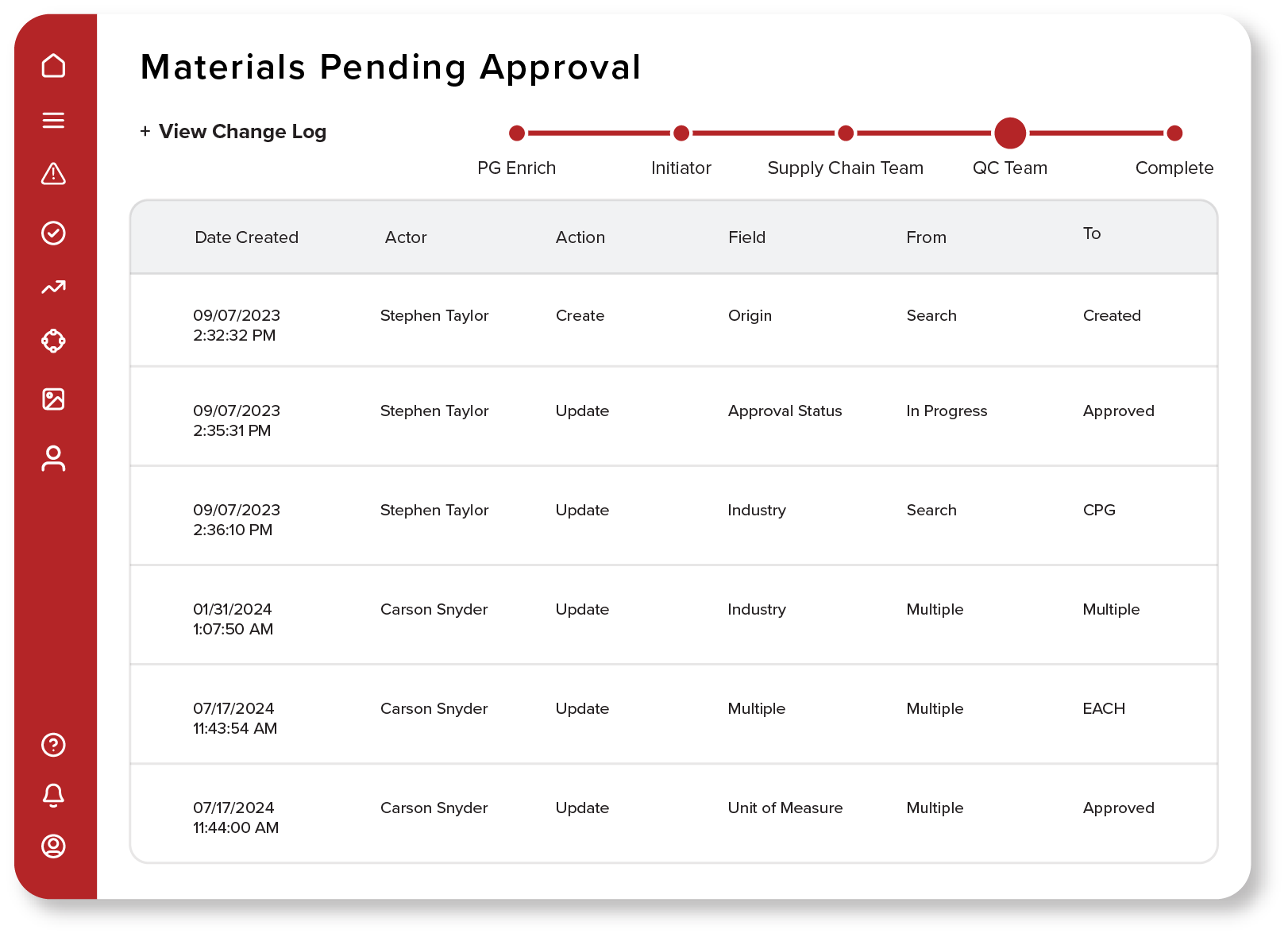
The original interface contained a large amount of critical operational data but suffered from visual complexity and competing information hierarchy. Users needed a clearer way to interpret risk barriers, threats, and consequences without being overwhelmed by the surrounding interface.
- Dense navigation
- Limited visual hierarchy
- High cognitive load
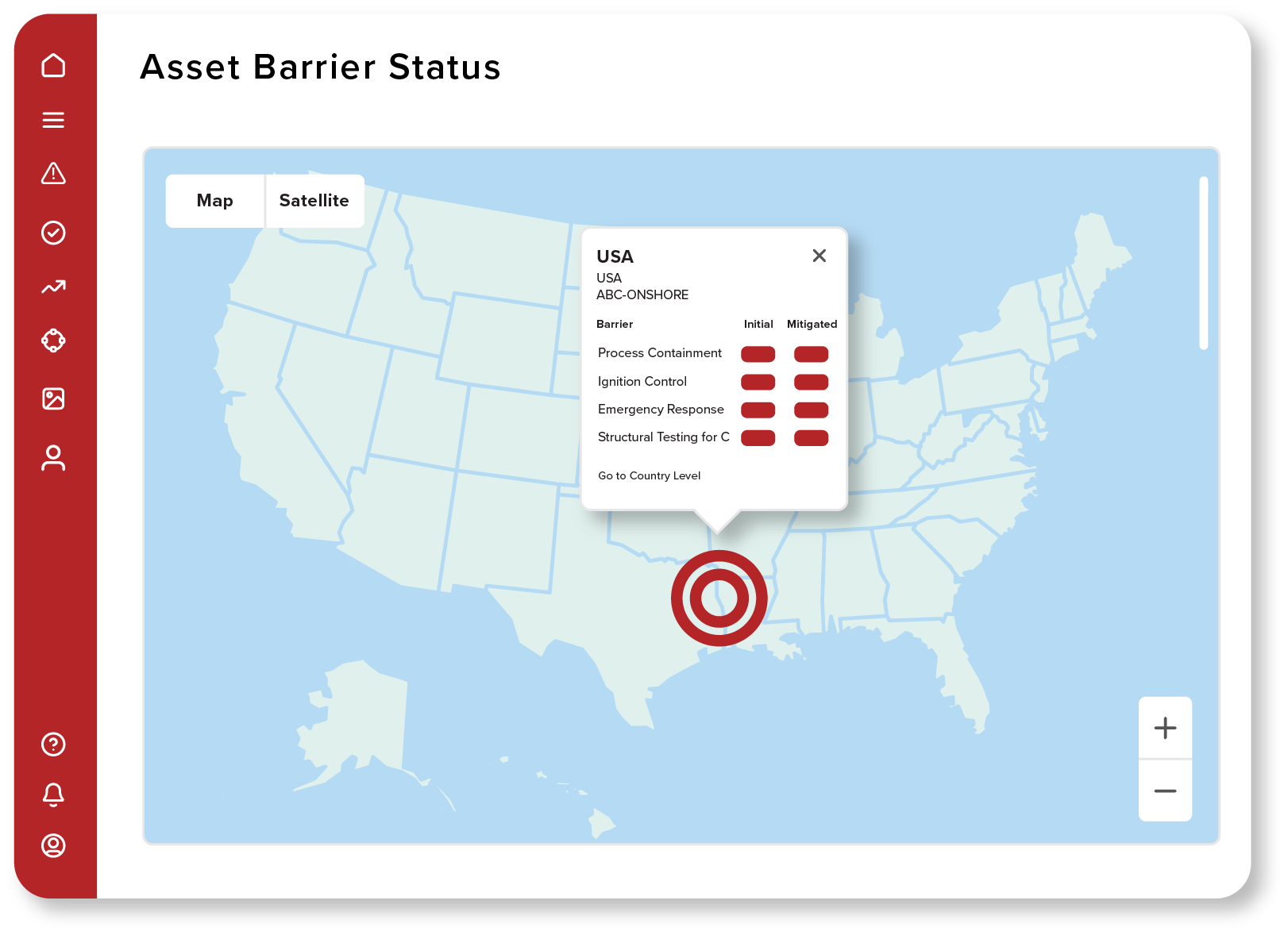
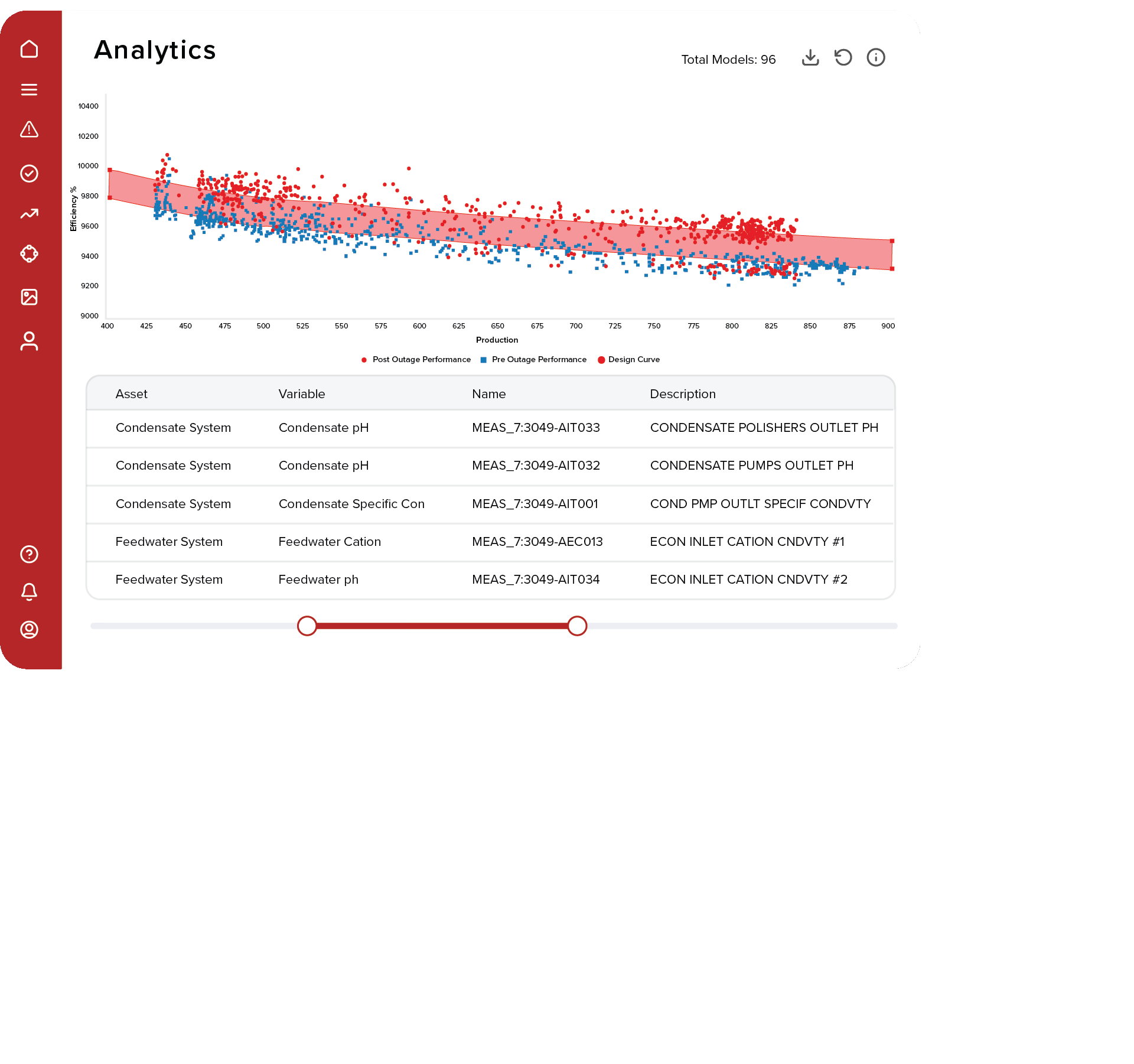
Solution
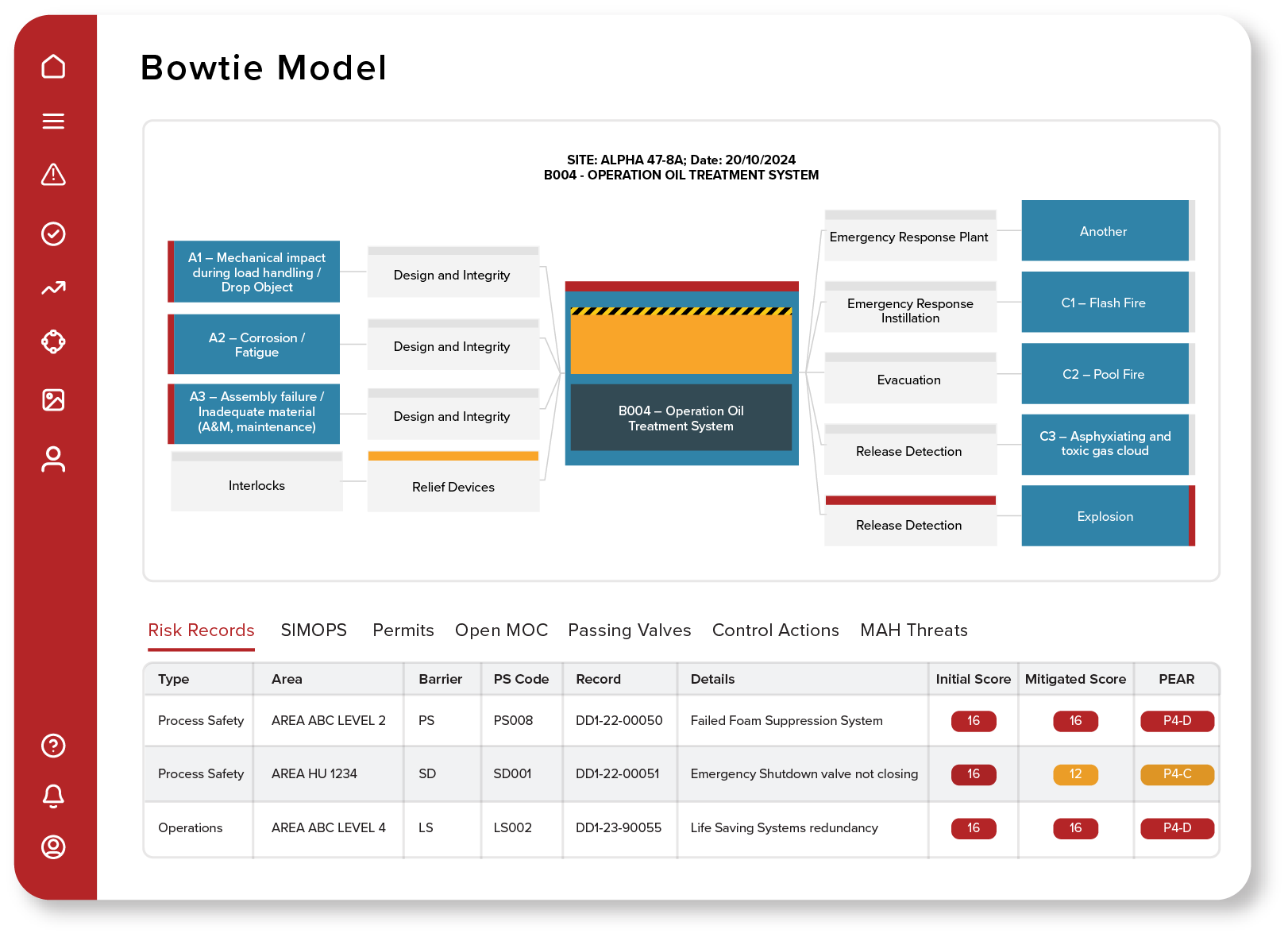
I reimagined the experience through a simplified visual framework that prioritized the Bowtie model, reduced visual noise, improved navigation, and established a more consistent design language. The redesign focused on making complex operational data easier to understand at a glance while maintaining access to supporting information.
- Streamlined navigation
- Improved information hierarchy
- Enhanced readability
- Focus on critical data
Reflection
One of the biggest takeaways from this project was learning how to design at scale.
Creating a single illustration is straightforward. Creating over 100 illustrations that all feel cohesive, support different product features, and remain visually consistent across an entire website is a different challenge entirely.
This project pushed me to think beyond individual assets and focus on building a system. Every decision, from composition and color usage to hierarchy and styling, needed to be repeatable, flexible, and easy to apply across future products and features.
It also reinforced something I believe strongly as a designer: complex ideas do not have to feel complicated. Through illustration and visual storytelling, technical software features became more approachable, easier to understand, and more engaging for prospective customers.
Looking back, the greatest success was not creating 100+ illustrations. It was creating a visual language that could continue growing alongside the product.